
Form builder allows you to create your own custom data capture aspect.
Quick Start
Key Concepts
Form Builder vs Aspects
The terms aspect and form builder are used frequently in Clio Operate. Here are some differences:
- Aspect: is a user interface section that can be added to an object (for example, a work item, participant, and ODS entity).
- Form builder: A special aspect type that you can use to add a custom data capture form to a blade. The aspect is the container in which your form is placed. Clio Operate configures connections for saving, so you don't have to.
Common Questions Answered
What Do Form Builders Look Like?
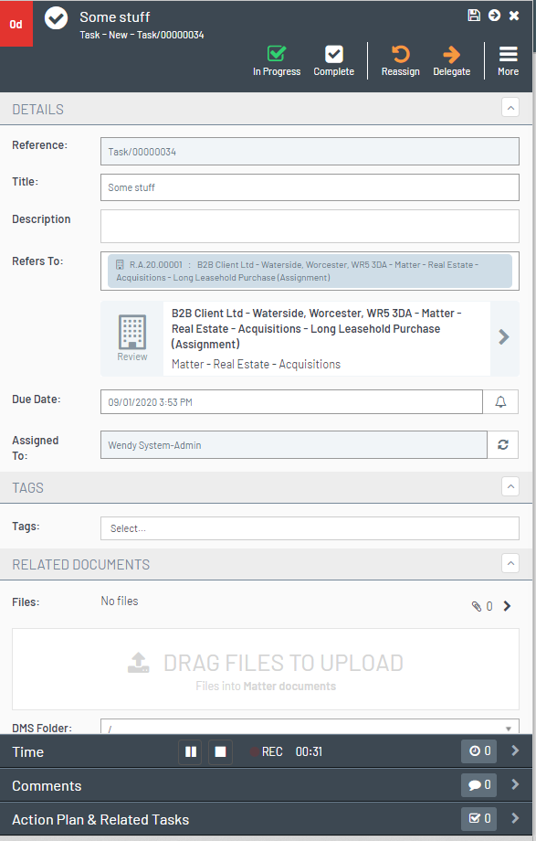
When you add a form to a blade using a form builder aspect, it is added as a section of the blade or a navigation bar, which shows the form on a separate blade. All work types have a key facts blade and these are made up of different aspects.
This is a task work type key fact blade.
Each section or navigation bar on the form is an aspect. In Modeller, the aspects for this work type look like this.
Choose the form builder aspect to add your custom data capture form to a blade.

Where Can I Use Custom Data Capture Forms?
You can use form builders in the following places:
- Add an Aspect to a Work type
- Participants
- Define ODS Types on a Participant Role
- Add Custom Data to a Participant
Work type includes many of the out-of-the-box work types such as instruction, case, payments, offers, tasks, and service requests.
Are Form Builder Aspects Inherited?
When you create a new work type as a derived type (child) of another work type, aspects are not inherited by default. The key facts blade starts out blank. The work type Modeller does, however, give the user the option to 'Copy from parent' to copy aspects, including form builder aspects, from the parent work type.
This option is found by pressing the aspects button on your chosen work type.
Can I Allocate Specific Permissions for a Custom Data Capture Form?
Yes. When adding the form builder aspect, use the padlock button to specify a specific global permission the user needs to access the aspect.
Can I Stripe / Contextually Display Aspects?
Yes. Custom data capture forms can be contextually displayed based on matching rules. Use the eye button to add a display rule to your form builder aspect.
How do you Display Custom Data Capture Using a Navigation Bar
You can display a custom data capture form on its own blade and access it from a navigation bar.
When setting up your form builder aspect, ensure you add it to the footer section of the blade. In the settings for the aspect, the display type is set to Nav Bar.
Do I Need To Make Any Database Changes to Add My New fields to the Database?
No. The Modeller framework handles that for you. You only need to configure your fields in form builder.
Do I Need to Make Any Changes to the Reporting Database When I Add New Custom Data Capture Fields?
No - fields added using form builder will automatically flow into the reporting database.
Will Changes to Data in Form Builder Fields Be Auditable?
The work type audit captures data. You can also capture changes in chronology by adding the chronology attribute.
Capturing Custom Data Changes in Chronology (Form Builder)
Form Builder Elements
The construction of a custom data capture form comprises the elements below.
| Element | Description |
|---|---|
| Form Definition | The form definition captures the generic information about the form such as the layout and title. When you create a new form, you use a standard template. You can use the template with just a new form title. |
| Section Definition |
Forms can be split into different sections to help organise the data in a way that is more structured for the user.
|
| Field Definition |
Defines the details for each individual field. Field definition can include details such as the title, format, display and help text for the field.
|
| Form Builder Aspect |
Added to a work type, participant, ODS entity or party type blade definition to show the form.
|
| GUID |
A GUID is the unique identifier given to each element. Each time you copy a snippet, you are provided with an individual guid for that item.
|


Unique field names per context
Each form field has a unique ID (GUID). However, the field name must also be unique within the specific entity it is configured in—this could be a work item, participant, organisation, or team, not just within an individual form.
For example, if a field named favouriteColour appears in two different forms within a matter, both instances share the same name but have unique IDs. If a user edits both forms in the same matter blade, only one answer is saved because the field name is shared across the matter. This behaviour ensures consistency when the same field appears in multiple locations.
However, the same field name used in different contexts—such as a person or a task—captures separate answers. This means that favouriteColour configured for a person will store a different value than favouriteColour configured for a task.
Snippets
The form builder tool comes with a set of snippets that provide examples of each field type and the available configuration.
Snippet's visibleIf attribute allows the field to be shown based on a condition. Make sure you remove the visibleIf from the snippet if you do not want to conditionally display the field. Otherwise, if the condition is not met, the field will not appear in your form. See the article Writing expressions using Form Builder visibleIf for more information.
Shared attributes in snippets
These appear across multiple field types in the snippets:
| Attribute (JSON Key) | Type | Example | Possible Values |
|---|---|---|---|
visibleIf |
string | "field1=true,field2=500" |
See visibleIf syntax |
chronologyCard |
boolean | false |
true, false
|
cssClass |
string | "alpaca-indent" |
Any CSS class names |
default |
any | true |
Default value for the field (type depends on field) |
requiredOnlyInPhases |
string | "some-phase" |
Comma-separated phase system names from config |
visibleIf Syntax
-
Simple:
fieldName1=value1,fieldName2=value2— field visible when all conditions match -
Expression:
: [Field1=5013314] AND ([Field2=true] OR [Field3=foo])— supportsAND,OR,[FieldName=value]
Common format tokens: YYYY (year), MM (month), DD (day), HH (hour 24h), mm (minutes), ss (seconds). See Moment.js format for full reference.
Mandatory in Phase
You can set a form builder field to be required only in specific phases by placing the “requiredOnlyInPhases” attribute on the field.

Click a snippet title in the list below to expand or contract information for that snippet. More details and examples will be added over time.
API Picker Field
Allows you to point the form builder field to an API endpoint (hosted by ShareDo, or in a ShareDo plugin) that will provide a list of values to be shown in a drop-down list.
It is similar to the Option Set picker, but the list of values comes from an API.

Attributes:
| Attribute | Type | Example | Possible Values |
|---|---|---|---|
endpointUri |
string | "/myEndpoint" |
API URL (e.g. /api/endpoint). May include [[token:sharedoId]]
|
allowNoSelection |
boolean | false |
true, false
|
multiple |
boolean | false |
true, false
|
placeholderText |
string | " " |
Any string |
visibleIf |
string | "field1=true,field2=500" |
See visibleIf syntax |
chronologyCard |
boolean | false |
true, false
|
- endpointUri: URI to a service that returns an array of elements (see below)
- allowNoSelection: if true, the 'None' option will be shown.
- multiple: allow multiple selection if true.
- placeholderText: label to use for the 'None' option.
- visibleIf: set visibility conditions using ‘field=value’ pairs.
- chronologyCard: whether changes to this field are logged to chronology.
- hideIfNoData: whether to hide this field if no data is returned from the API
The endpoint specified in the endpointUri setting must return a JSON array in the following format:
[
  {text: 'Item One', value: '1'},
  {text: 'Item Two', value: '2'},
  // etc.
]
The text property is the user-facing text that will be shown for each item.
The value is the identifier for that item, and should be unique.
ShareDo contains an example endpoint that returns a list of countries in this format.
Add an API Picker Field, and set the endpointUri to
/api/lists/00000000-0000-0000-0000-000000000000/test-list-countries?format=alpaca
to see a working example of this control.
Boolean
Adds a check box to the form.

Attributes:
| Attribute | Type | Example | Possible Values |
|---|---|---|---|
visibleIf |
string | "field1=true,field2=500" |
See visibleIf syntax |
chronologyCard |
boolean | false |
true, false
|
cssClass |
string | "alpaca-indent" |
Any CSS class names |
default |
boolean | true |
true, false
|
Currency
Displays a currency field. 

Attributes:
| Attribute | Type | Example | Possible Values |
|---|---|---|---|
allowEmpty |
boolean | false |
true, false
|
allowPositive |
boolean | true |
true, false
|
allowPositiveMsg |
string | "Can not be a positive value." |
Any string |
allowNegative |
boolean | false |
true, false
|
allowNegativeMsg |
string | "Can not be a negative value." |
Any string |
overrideCurrencyCode |
string | null |
ISO 4217 code (e.g. GBP, USD) or null
|
visibleIf |
string | "field1=true,field2=500" |
See visibleIf syntax |
chronologyCard |
boolean | false |
true, false
|
Date
Date field. Provides a calendar date-picker from which a user can pick a date. 
See the Form builder data/time field enhancement section of the ShareDo v7.6.0 Release Notes for important information on the displayFormat attribute. In versions before v7.6, the format attribute was used but restricted date formatting to the ISO 8601 standard (YYYY/MM/DD). Changing the date format could cause issues in ShareDo.
Attributes:
| Attribute | Type | Example | Possible Values |
|---|---|---|---|
displayFormat |
string | "DD/MM/YYYY" |
Moment.js format — e.g. YYYY, MM, DD, HH, mm, ss
|
visibleIf |
string | "field1=true,field2=500" |
See visibleIf syntax |
chronologyCard |
boolean | false |
true, false
|
DateTime
Date time fields. Provides the user with a calendar and clock control to pick the date and time. 
See the Form builder data/time field enhancement section of the ShareDo v7.6.0 Release Notes for important information on the displayFormat attribute. In versions before v7.6, the format attribute was used but restricted date formatting to the ISO 8601 standard (YYYY/MM/DD). Changing the date format could cause issues in ShareDo. 
Attributes:
| Attribute | Type | Example | Possible Values |
|---|---|---|---|
displayFormat |
string | "DD/MM/YYYY HH:mm" |
Moment.js format — e.g. DD/MM/YYYY HH:mm
|
visibleIf |
string | "field1=true,field2=500" |
See visibleIf syntax |
chronologyCard |
boolean | false |
true, false
|
Decimal
Displays a decimal. Use configuration to set the precision (the number of digits) and the min and max values.

Attributes:
| Attribute | Type | Example | Possible Values |
|---|---|---|---|
precision |
integer | 1 |
Non-negative integer |
minValue |
integer | 0 |
Any integer or null
|
maxValue |
integer | 100 |
Any integer or null
|
visibleIf |
string | "field1=true,field2=500" |
See visibleIf syntax |
chronologyCard |
boolean | false |
true, false
|
Header
The header snippet lets you add header-style text to your form. 

Attributes:
| Attribute | Type | Example | Possible Values |
|---|---|---|---|
labelText |
string | "This is a header" |
Any string (HTML allowed) |
cssClasses |
string | "example-css-class1, example-css-class2" |
Any CSS class names |
elementType |
string | "h2" |
"h1", "h2", "h3", "h4", "h5", "h6" — HTML heading element |
visibleIf |
string | "field1=true,field2=500" |
See visibleIf syntax |
chronologyCard |
boolean | false |
true, false
|
Icon Picker
This creates a field that allows you to pick an icon.

Attributes:
| Attribute | Type | Example | Possible Values |
|---|---|---|---|
visibleIf |
string | "field1=true,field2=500" |
See visibleIf syntax |
chronologyCard |
boolean | false |
true, false
|
Integer
Displays an integer. Use configuration to set the min and max values. 
Attributes:
| Attribute | Type | Example | Possible Values |
|---|---|---|---|
minValue |
integer | 0 |
Any integer or null
|
maxValue |
integer | 100 |
Any integer or null
|
visibleIf |
string | "field1=true,field2=500" |
See visibleIf syntax |
chronologyCard |
boolean | false |
true, false
|
Label
The label snippet lets you add a text-only label to your form.

Attributes:
| Attribute | Type | Example | Possible Values |
|---|---|---|---|
labelText |
string | "This is a label" |
Any string (HTML allowed) |
cssClasses |
string | "example-css-class1, example-css-class2" |
Any CSS class names |
visibleIf |
string | "field1=true,field2=500" |
See visibleIf syntax |
chronologyCard |
boolean | false |
true, false
|
Memo
The memo field provides a multi-line text field. Use the rows attribute to specify the initial number of rows to display on the form. 
Attributes:
| Attribute | Type | Example | Possible Values |
|---|---|---|---|
rows |
integer | 10 |
Positive integer |
richText |
boolean | true |
true, false
|
maxLength |
integer | 5 |
Positive integer or null
|
showMaxLengthIndicator |
boolean | true |
true, false
|
requiredOnlyInPhases |
string | "some-phase" |
Comma-separated phase system names |
visibleIf |
string | "field1=true,field2=500" |
See visibleIf syntax |
chronologyCard |
boolean | false |
true, false
|
ODS Entity Picker
This field creates an ODS picker that displays a filtered list of ODS entities based on the selected role.

Attributes:
| Attribute | Type | Example | Possible Values |
|---|---|---|---|
multiple |
boolean | true |
true, false
|
roleSystemName |
string | "role1" |
Role system name from config |
showSearch |
boolean | true |
true, false
|
showInlineSearch |
boolean | true |
true, false
|
searchRelated |
boolean | false |
true, false
|
visibleIf |
string | "field1=true,field2=500" |
See visibleIf syntax |
Option Set Picker
This snippet allows you to add a drop-down list to your form. 
Attributes:
- Use the optionSetName attribute to specify the system name of the option set (found in admin under the data dictionary).
- Use the multiple option to specify whether the user can select more than one item from the list.
Note that if a subsequent field has a visibleIf display option based on the option set selection, then you should use the ID of the selected item rather than the option set value name.
| Attribute | Type | Example | Possible Values |
|---|---|---|---|
optionSetName |
string | "option-set-name" |
Option set system name from ODS |
allowNoSelection |
boolean | false |
true, false
|
multiple |
boolean | false |
true, false
|
placeholderText |
string | " " |
Any string |
showSelectedColour |
boolean | false |
true, false
|
showSelectedIcon |
boolean | false |
true, false
|
visibleIf |
string | "field1=true,field2=500" |
See visibleIf syntax |
chronologyCard |
boolean | false |
true, false
|
Participant Picker
The participant picker field allows a user to select a participant. 
Attributes:
- multiple: if set to true, allows you to select multiple participants.
- roleSystemNames: Provides the participant role system names you are selecting.
- includeAncestors: allows selection of participants from ancestors (for example, if you have a task with a parent work type, it includes the participants form the parent work type.)
- includeAncestorTypePaths: specifies the type paths where you want to limit selection (for example, matter).
- allowParticipantAdd: allows the user to add a participant.
- autoSelectSingleParticipant: if there is only one participant available, it will be autoselected if this is set to true. This only works if the “multiple” attribute is set to false.
| Attribute | Type | Example | Possible Values |
|---|---|---|---|
multiple |
boolean | false |
true, false
|
roleSystemNames |
string | "role1,role2" |
Comma-separated role system names from config |
includeAncestors |
boolean | false |
true, false
|
includeAncestorTypePaths |
string | "/matter/,/proceeding/" |
Comma-separated type paths |
allowParticipantAdd |
boolean | false |
true, false
|
autoSelectSingleParticipant |
boolean | false |
true, false
|
visibleIf |
string | "field1=true,field2=500" |
See visibleIf syntax |
chronologyCard |
boolean | false |
true, false
|
Percentage
Captures a percentage value. 
Attributes:
| Attribute | Type | Example | Possible Values |
|---|---|---|---|
precision |
integer | 1 |
Non-negative integer |
minValue |
integer | 0 |
Any integer or null
|
maxValue |
integer | 100 |
Any integer or null
|
visibleIf |
string | "field1=true,field2=500" |
See visibleIf syntax |
chronologyCard |
boolean | false |
true, false
|
Section
Defines a new section on the form.

Attributes:
| Attribute | Type | Example | Possible Values |
|---|---|---|---|
visibleIf |
string | "field1=true,field2=500" |
See visibleIf syntax |
chronologyCard |
boolean | false |
true, false
|
Text
Provide the addition of a standard text field. 
Attributes:
| Attribute | Type | Example | Possible Values |
|---|---|---|---|
placeholder |
string | "Placeholder Text" |
Any string |
maxLength |
integer | 5 |
Positive integer or null
|
pattern |
string | ".*" |
Valid regex pattern |
visibleIf |
string | "field1=true,field2=500" |
See visibleIf syntax |
chronologyCard |
boolean | false |
true, false
|
Toggle
Adds a toggle button to your form. 

Attributes:
| Attribute | Type | Example | Possible Values |
|---|---|---|---|
dataOn |
string | "Yes" |
Any string (displayed when on) |
dataOff |
string | "No" |
Any string (displayed when off) |
buttonWidth |
string | "100px" |
CSS width (e.g. "100px") or null |
buttonHeight |
string | "" |
CSS height or null |
requiredOnlyInPhases |
string | "some-phase" |
Comma-separated phase system names |
visibleIf |
string | "field1=true,field2=500" |
See visibleIf syntax |
chronologyCard |
boolean | false |
true, false
|
default |
boolean | true |
true, false
|
Tree Selector
The tree field creates a tree list that allows multi-select. 
Attributes:
| Attribute | Type | Example | Possible Values |
|---|---|---|---|
optionSetName |
string | "option-set-name" |
Option set system name from ODS |
multiple |
boolean | false |
true, false
|
selectMode |
string | "LeafOnly" |
"LeafOnly", "Any" (see notes below)
|
displayMode |
string | "Single" |
"Single", "Full" (see notes below)
|
placeholderText |
string | "Select..." |
Any string |
visibleIf |
string | "field1=true,field2=500" |
See visibleIf syntax |
chronologyCard |
boolean | false |
true, false
|
-
selectMode values:
"LeafOnly"restricts selection to leaf nodes only. Any other value (e.g."Any") allows selection of any node (leaf or parent). Only"LeafOnly"is explicitly checked; there is no constant for the alternative. -
displayMode values:
"Full"shows the full label path in the selection (e.g.Parent > Child > Leaf)."Single"(or any non-"Full"value) shows only the selected node’s label. Use one value only:"Single"or"Full".
Unit of Measure
This field creates a picker where you can select a unit of measure.

Attributes:
| Attribute | Type | Example | Possible Values |
|---|---|---|---|
unitOfMeasureType |
string | "unit-of-measure-type-system-name" |
Unit of measure type system name from config |
multiple |
boolean | false |
true, false
|
allowNoSelection |
boolean | false |
true, false
|
placeholderText |
string | "Select..." |
Any string |
visibleIf |
string | "field1=true,field2=500" |
See visibleIf syntax |
chronologyCard |
boolean | false |
true, false
|
Audit Trail / Chronology
Changes to form builder fields are, by default, captured in the audit history. To add field changes to the chronology, use the chronology attribute.
Capturing Custom Data Changes in Chronology (Form Builder)